This is the second part of an ongoing series looking at building a custom documentation portal from scratch, that uses the Swagger open source tools as well as our professional platform - Swaggerhub.
If you haven't taken a look at the first part on setup and building the initial framework, it can be found HERE - or the repository with the completed code is available HERE, and is hosted HERE.
In the first part of this series, we focused on the environment and tools that would be used in creating a documentation portal, as well as building out the initial components to both acquire and render the documentation dynamically. Now that we have that base layer built - we can start to look at customizing this portal to really make it our own.
As with anything in web development - there are many ways that we could approach doing this. Ideally, we would be creating a custom template we could pass against the SwaggerUI component (instead of the current 'baseLayout') to really change the page layout as well as its style which is something that will be explored in another part of this series. For our initial use case, we will just explore some of the big ticket components and classes that we should be tweaking to start to make the documentation look a little less 'cookie cutter'.
Setup
For our demo site, we are imagining that an infamous Galactic Empire is going through a digital transformation - one that will hopefully take the galaxy by storm and help with their upcoming expansion goals. As different teams and groups within the larger organization peel away from the traditional monolith development process and begin to expose their own internal services, there is a need to make the documentation for all of these accessible in a single location, and from a style perspective to match with the overall branding and 'feel' of the Galactic Empire.
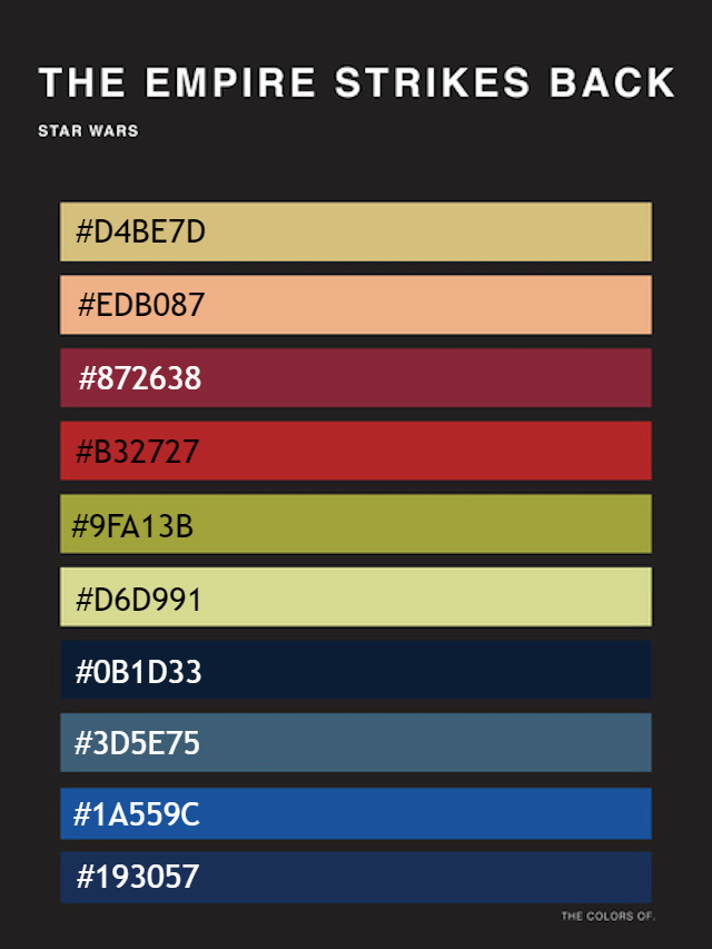
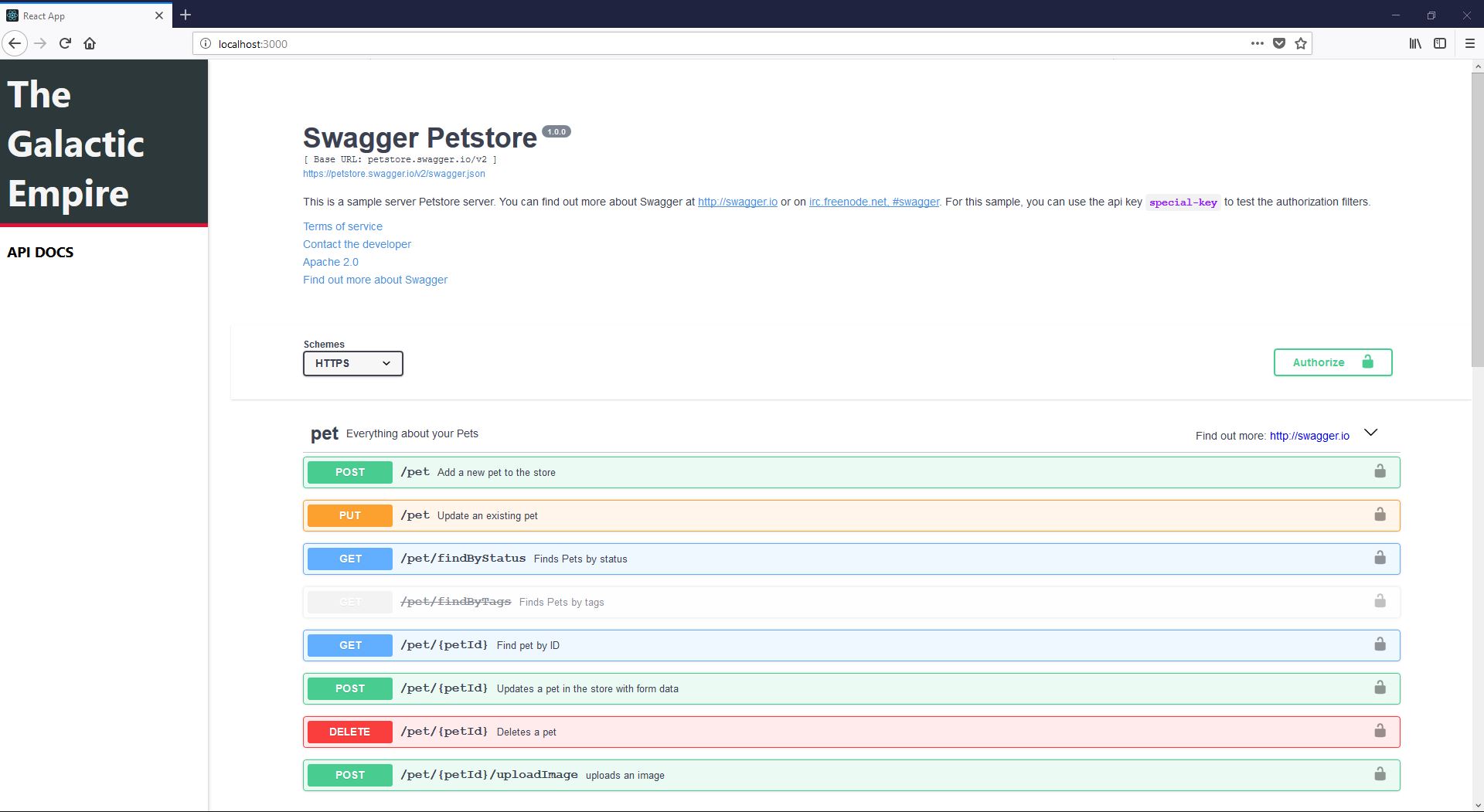
Currently, we are using the base style for the SwaggerUI component on a bright white background, which is serviceable but at a contrast with the overall look and feel of the organization. We also don't have any imagery or logo's included to act as a visual aid for our brand. Luckily, we were provided a color palette to work from that will make the task a little easier, and have a font library and logo to rely on that is being used across the organization.

Over the next few steps, we will quickly build out a darker color scheme for the site and update our sidebar header to include custom fonts, a logo, and sub-header. As mentioned above, this is not the ideal way to do this - but as a relatively simple way to use both the default style of SwaggerUI and our own CSS options, it works for the time being.
Updating the page style
The first thing we should look at is the structure of our current style sheets - based on what we built in the previous tutorial, we know we can start to update base components like the page body and sidebar, while the central 'documentation' pane will have to be updated based on the existing names and structure of the SwaggerUI component..

Let's look at updating the sidebar to align with our final vision. This should be pretty straightforward, as we have a single sidebar body class side-bar and the links share a common class name api-link. Currently, these all live under the same App.css file which worked fine for our initial setup.
To make things manageable let's create a /css folder and move all the CSS files except for index.css which is required by create-react-app. As the application starts to grow, it's important we keep our components and dependencies organized and cut down on confusion. Make sure to add the required import statements in index.css to load in the files from their new locations.
We can also take this chance to pull in the dependent stylesheets that we are loading from the SwaggerUI component. Instead of looking back into our /node_modules folder (which creates the opportunity for issues depending on how this is built through certain host services), we can pull the stylesheet into the /css folder we just created to keep it next to our other required files. This file is currently located at /node_modules/swagger-ui/dist/swagger-ui.css, or can be copied from the gist below.
Messy - and a big reason we will explore building a from scratch template in future posts. For now, we can go ahead and tweak the side-bar styling before moving on to working with the header and documentation style. We have a color set from the color list above, so we can go ahead and update the side-bar.css file.
The updates are pretty simple, we will tackle the header in the next section - for the time being we just:
- Darkened the sidebar background
- Inverted text colors to stand out against a dark background
- New fonts in the sidebar panel
Most of these changes should be straightforward to customize - for the custom fonts (used now and later) - make sure to add the link statement to the highest level .html page that is being rendered in the browser. The ones shown in this project are from Google Fonts - but any will work.
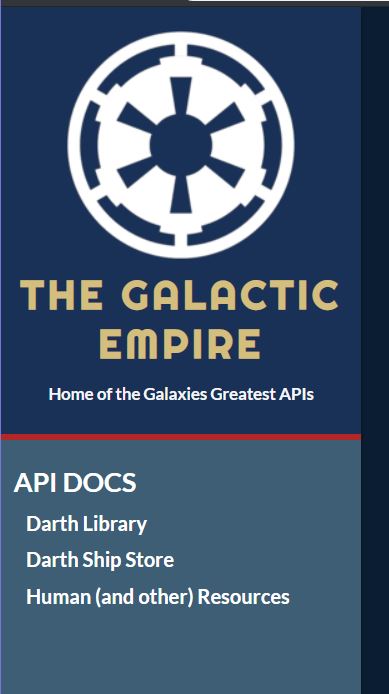
We should now have a modified sidebar, but the rest of the page should look pretty standard - before we update the body of the page, we can add some more customized elements to the side-bar header to align it with the rest of the page style.
Updating the Header
We know we will be adding images and updating the layout of the side-bar header, after which we will make a few tweaks to the style sheet to get everything displaying correctly. We should have a couple of classes that we want to focus on here, namely side-bar-header and the h1 element inside it. Starting with the logo image - we could store this in the same /src directory as the rest of our files, but let's imagine we have a CMS or image repository to house these files - so if they are ever updated we don't need to change anything on the application side. We know that we already have some information stored in the organization_config.json file we created before, and should just need to make sure we have current data in the JSON object.
Now we need to update the sidebar component to show this new information. Open Sidebar.js and update it to account for the sub-header and image.
We are already doing the bulk of the heavy lifting by bringing in the JSON object, all we really needed to do was give the values somewhere to live:
- Added the img and pointed it to the remote URL
- Added in a sub-header as an h3 element
Finally, we should update the CSS file to account for the new elements. Some minimal changes clean things up and give the page some much-needed context.

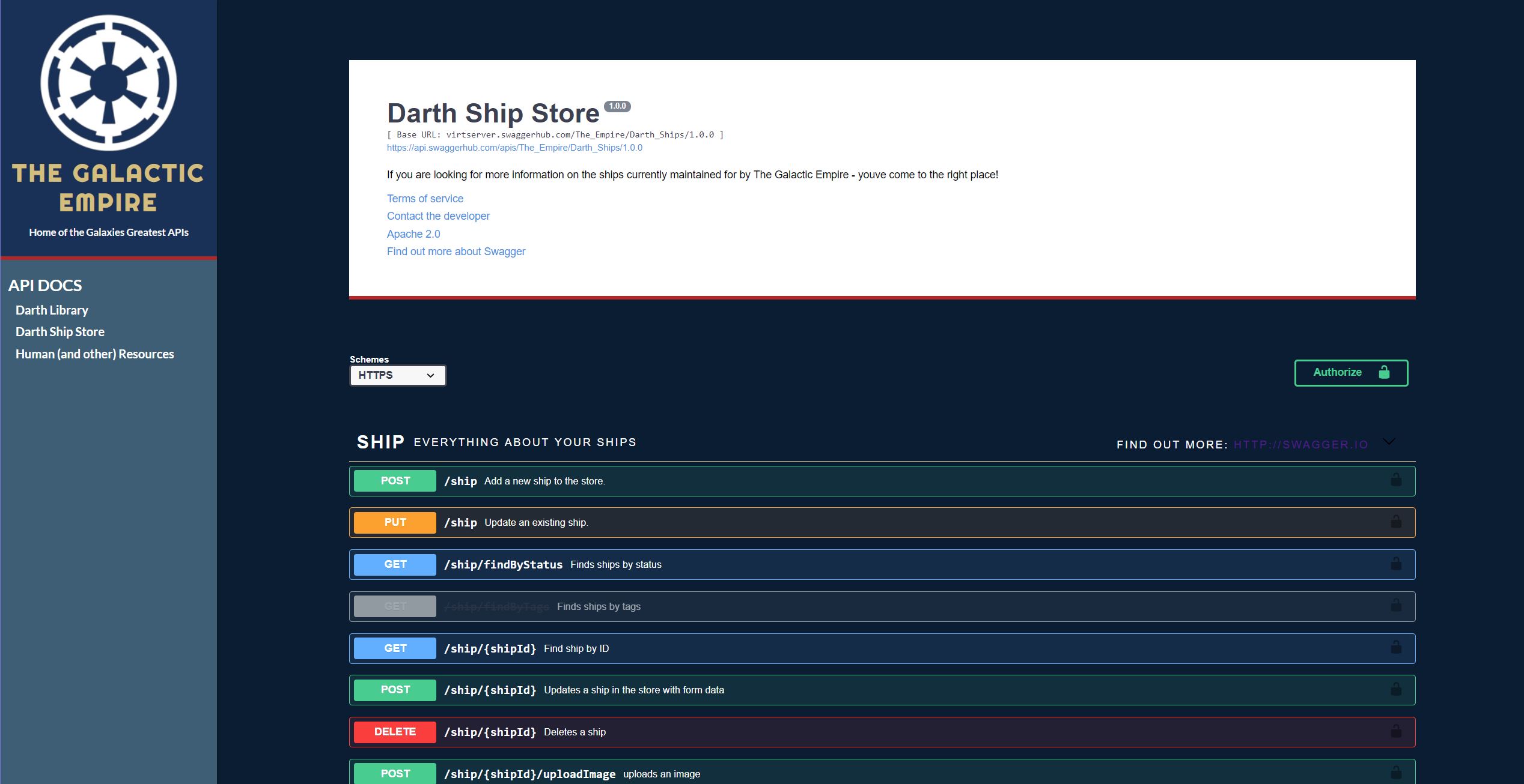
At this point, the sidebar should be looking pretty good, we have the updated style and are bringing in some new information to be shown in the header section. The last step in the process will be to change the SwaggerUI styling to render nicely on a dark background.
Updating the Documentation Style
Finally, we can turn our attention to the documentation component itself. Currently, it probably looks pretty un-usable - dark fonts on a dark background. The SwaggerUI is pretty aggressive in how it chooses what stylesheets to render - traditionally we should have been able to load our custom styles, followed by the default sheet we brought in, and CSS hierarchy would float our changes over the baked in ones. Unfortunately, regardless of the import order, the SwaggerUI style is taken as truth, which means in order to update the style we have to be very granular.
The best way to approach this is to use something like the Chrome developer tools inspection view and grab class names based on the elements that are getting obscured. The below stylesheet has a core set of text and style elements that were updated to render cleanly on the dark blue background that we implemented earlier.
At a high level, the changes are pretty straight forward:
- We grab all of the info block using
.swagger-ui .info and bring in a white background, adding some padding to give it room to breathe. The .description p updates the description text to show on a white background.
- All the op-block tags (tags in the OpenAPI definition) are switched to show in white
- The operation descriptions, titles, names etc. are grabbed one by one and shown in white
- The model section at the bottom of the page is updated to square off the edges and show more clearly over the dark page.
To recap:

When we reload the page, it should be far removed from the initial design that we implemented - more in line with the overall 'look' of the organization in this case. Looking back, it's great that we are able to lean on the SwaggerUI library to handle the bulk of the styling, and we can pick and choose what gets updated - but it could easily get very messy, very quickly. Using things like the inspection tool help get us where we needed to go, but end up giving us a pretty rigid and granular solution that couldn't easily be modified by someone brand new to the project.
Luckily, we have a solution! SwaggerUI allows the passing of custom layouts - so instead of using the default 'BaseLayout' that we have in this case, we can start to move and style the entire page as we see fit. This will give us the flexibility to not only style the page more easily, but also to consider new arrangements of data on the screen - things like a side by side view (commonly seen in libraries such as Slate) as opposed to a column view that we have been working with so far. We will do this from scratch in an upcoming post.
For the time being, hopefully, this post gives you the foundation to start to layer on some custom styles and information to the SwaggerUI defaults we initially set up. The next post in the series explores how to quickly deploy the application we've built to a couple of different host options (such as Netlify) - as well as linking back to a private organization in Swaggerhub by adding environment variables and an authenticated API call.